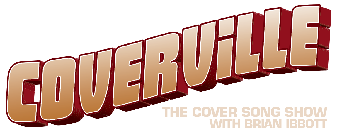
I’m really excited to announce the new look for the Coverville brand!

Over the next few weeks, you’ll see this logo appear in the RSS feed, in the menus of the site, and on your mp3 player as you listen to the show. I think it updates the look of the show, and I can’t wait to see how it looks on an iPhone.
Big thanks to Shelby over at Shifted Sound for his design on this. (If you haven’t heard his show yet, click here to go to his site and listen to the latest show. It’s great independent music, and now there’s even a CD available, which I’ll talk more about in the next week or so.)
Shelby also designs the graphics for the t-shirts on CafePress, so you’ll see this logo, as well as his other new designs on all the merch. Now’s a great time to shop!
I like it very much!!
A little like the “Cover me” intro, the old branding had a warmth about it, a “family” feel…can’t explain that well! So I’ll probably miss it to some degree, but, at the same time, I like the new branding – very modern. The Green looks good on my display.
Progress is good!
Although I like the new logo, the old logo is self-explanatory. Even if I didn’t know what a cover is, I could tell from the logo that this is probably a music podcast. I notice that the new logo needs an explanation “the cover music podcast”.
Great, now I gotta get a new tee shirt!
it’s bold, it’s new – dig it!
and, perhaps, out of affection for the old logo, you can bring it out of retirement on occasion – like hockey teams do with their original jerseys!
Ewwww. It looks like boogers.
And also what eBob said.
I love the new logo! Go with it.