I’ve got some very smart listeners.
You know, as someone who actually graduated college with a Visual Communications degree, you’d think I’d know better.
But many of the comments I’ve received about the new branding bring up excellent points, that in all the time I’ve been doing this, I’d forgotten. I think the most important of which is the brand interpretation. If someone were to just see the logo, whether it’s on a business card, another website, a t-shirt, etc., would they know what the show is about, instantly? I guess there’s no real easy way to iconify “cover songs”, but what the old logo did was convey two things:
The postcard-style text (which I think only gets recognized as such by people over 30) suggests that Coverville is a place.
The CDs in the background (and the album covers in the original version), convey music.
Coverville is a place for music. Throw the word “Cover” in there, from the title, and you’ve got the gist of it:
A place for cover music.
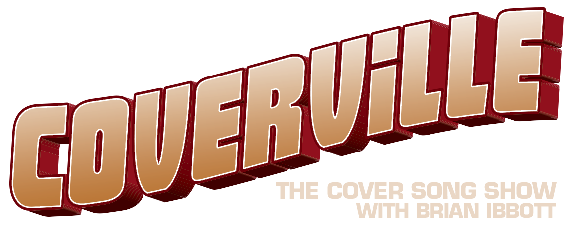
While I think the new logo looks spectacular, and absolutely gorgeous, it doesn’t say what Coverville is, and I don’t have a big enough name (yet) to be universally recognizable with any branding.
I guess my biggest concern with the current (postcard-style) logo is that it doesn’t translate well in smaller sizes, and it doesn’t work well in black and white. Perhaps I simply need to improve those elements, as opposed to a radical (in both senses of the word) change like this. Perhaps not. There’s an old-fashioned look to the postcard-styled logo that I don’t like. And it’s instantly rectified by the look of the new logo.
With most things show-related, for this I turn to you as a listener of the show, to pass on suggestions for improvements that can be made to the look and feel of the logo, as well as the website. And as a special treat – something that I think I’ve only shown the group that attended the Podcast Expo presentation I did in 2005 – here is a scan of the original concept artwork for Coverville.
![]()
This was done about a week before I recorded the first show.
The postcard-style text (which I think only gets recognized as such by people over 30)
And those of us who collect postcards? *grin*
I’m not over 30, I’ve just celebrated 7 anniversaries of my 29th birthday!
~Sharon
O.C.H.
I think the old image is good, but maybe looks a little drab, colour wise (yes, I know, but my English spelling is authentic!).
I actually just had an idea. Playing on the place name, how about an image of a Town sign, that you see when you enter a town, with the posts represented and maybe the ground, to give it perspective.
The sign would say,
“You are now entering Coverville, population 33,000 and rising.
The Home of Cover songs
Mayor: Brian Ibbott”.
Now getting that to be seen on an i-pod or on screen might be a challenge.
If you want more Brian, let me know and I can draw this or something.
Regards
Wayne
O.C.UK.C
Wayne, I like that idea, or maybe use one of those signs that says how far away a city is.
Brian,
Your show is pitched mainly at people who are at least a little bit music-geeky. After all, if you don’t have the original of, say, Brilliant Disguise, how are you going to fully appreciate Elvis Costello’s twangy reimagining? That’s half the fun of covers – judging them against the version that’s hard-coded in our memories.
So…..
Why not make your logo a reimagining of classic album covers, with the main title redone, simply, as Coverville?
So, Sgt. Pepper, with “Coverville” in the flowers. Highway 61, with “Brian Ibbot Coverville.” The white album. Velvet Underground – Banana. London Calling/Elvis Presley.
You get the picture….
Another aproach would be to use the look/feel of classic record labels. Think of the red Columbia going in circles, The Tamla, Capitol or Atlantic labels. Anything that allows you to present a single word (Coverville) in a way that instantly reads as “record label.”
I think whatever is done with the logo that there should be some sort of a contest where the covervillians decide what the logo is, since I know I would feel good knowing I had a hand in the decision making process. Just a thought.
I like all these ideas, but I think Wayne’s is my favorite.
Not sure what you’d use for a population…episodes, users on the message board, etc. Is there a way to get a count of distinct downloads per episode?
Less about branding. More shows. Need I say more?
Are there enough classic album covers with highly recognizable typography that you could get the letters to spell “Coverville”? If it did not turn out to be hideous, a ransom-note-style collage of letters with obvious musical origins would solve some problems, including scaling down to an iTunes icon without losing all of the salient details.
Or maybe a series of images, each done in a different band/album’s recognizable font? “Coverville” scrawled across Pink Floyd’s wall, written in lipstick over the photos of “Exile on Main St.,” or imitating the distinctive logos of The Beatles or Led Zeppelin? An animated GIF, perhaps, or rotated by the web server so a different one shows up every time? More of a technical challenge, but potentially less of an eyesore than my previous idea.
Funny, a lot of these ideas actually surfaced on the site in the early months.
I had a roadsign version that I actually took out here in West Denver, as well as a couple of other roadsign versions. And I was going to do the whole arrangement of album covers, but got too busy to much further than Supertramp’s “Breakfast In America”.
I’ll post them – they’re a lot of fun.
I’d actually really like to continue doing the album cover idea. I’d been getting back into those recently with the ABBAVille and SkaVerville shows. Maybe that’s a possible direction to go.
I agree that the logo should reflect the content (brand) of the site. I work as a graphic designer and in my opinion, the simplier the logo is, the better it is. Take a look at all the most recognizable logos in the world and they are all very clean and simple (e.g. Apple, McDonalds) I think Simplifying the current logo would do the trick.
Sure, but how important is it these days for a logo to encapsulate what the product or service is about? Your examples, Apple – says nothing about computers or…ahem…phones, and McDonalds reflects nothing about hamburgers.
You so rarely see an icon these days that doesn’t have the context of information to support it. 50 years ago, it was much more important. Your interaction with a company was very limited up until purchase of the product or service. We are delgued these days with context for our ads. The internet, magazines, television commercials.
The Nike swoosh? Nothing about shoes.
The Coca Cola “Dynamic Ribbon Device” (yes, that’s what it’s called) – could be argued that it looks like liquid being poured, but that’s a stretch.
Maybe I’m going out on a limb, but I don’t think the Coverville logo has to contain anything that implicitly says “music”, “covers” or “podcasting”.
And maybe that’s a step that podcasting needs to take to be more accepted by the mainstream. A large portion of people have heard about podcasting, but maybe still don’t get it, or think that it’s too techie for them to get involved with. If something is branded that looks like a podcast, smells like a podcast, the people who don’t get it won’t get any closer to accepting it. If it’s vague, it might pique someone’s interest enough to check out a website to find out more, and then boom – hopefully you’ve got them.
But this is just me throwing out ideas here. Am I missing a bigger picture?
And Paul, I absolutely agree – I’d love to have a simple logo. (Not necessarily “Sony”-simple, but you get the idea.)
I think the point about the iconic logo’s such as Apple and Nike is not that they say what the product is (though Apple Computer beforehand said something). It is to convey a feeling, to reassure you and convey an image of quality, or in Nike’s case, of being hip. As a recent IMac owner, I bow at the feet of the Jobs and the Ive (chief designer – a Brit!), but their logo says something about them and their products and conveys simplicity.
What do I know though, I’m just a designer/marketing guru trapped in a Tax specialists body!!
I like the idea of simplifying the logo as it is. It says “something”.
All are fine points. The important thing, to me, is visual appeal. I like the old logo, but it wasn’t until my third or fourth visit to the site that I actually examined the coverville logo and noticed LP records and CDs in the lettering. The choppy colors distract a bit from the lettering. I like the one-color idea in the new logo.
You have a point, Brian, about the techie-fearing people. There are many (most are older than, say, age 25.) I cannot believe the number of people I know that still believe you must own an iPod to listen to a podcast!
That’s nothing Nat – most people I know at work have NO IDEA what a podcast is, even the ones with I-pods etc.!
I honestly have no idea what they do with the machines when there are a LOT of ways to listen to free music, hear new opinions etc.
I would like to see more classic album covers done Coverville-style. The Supertramp cover was very well done.
You do know that the original postcard version (which is my favorite) echoes the old Springsteen album cover “Greetings from Asbury Park, New Jersey.
Ralph
I think the point may be that the logo may not have to say “music”, “covers” or “podcast” or convey that – but it should convey a feeling about the show. Which (as I said privately to you Brian) I thought the new logo did not convey the feeling of the show. When you look at the potential new logo’s color scheme – what feelings does it evoke?
Now think about what feelings does your show evoke from people – warmth, a personal connection to the DJ, hip but not in your face, etc….
So I offer up – what radio stations/podcasts evoke a similar feeling? In my area – WXPN from Philadelphia would be close – look at their website at http://www.xpn.org – what does the color scheme say about the station? Other examples (mainly AAA radio stations) – http://www.kfog.com , http://www.wbos.com , http://www.kcuvradio.com/ , and even http://www.triplearadio.com .
Do you see where I’m going with this? I think something a little more sophisticated yet still hip and cool might be better then the neon green in your face thing. Not to mention that the show name does get lost in the green circles.
–*Rob
I was going to say the same thing – I immediately thought of “Greetings from Asbury Park” and always thought it was intentional, particularly since the “theme” music for Coverville is a Bruce Springsteen cover, as well.
I like the “postcard” logo, and I agree with the poster who suggested experimenting with color changes while preserving the basic “theme” of the current logo.
RobbL
That other one is SOOOOO awesome. go with that one please!